A shared source of information
Bring requests, quotes, statuses and history together so information was no longer scattered across conversations.
Sullair Argentina · UX/UI
Over 20 weeks, we designed a portal that brought requests, quotes and tracking together for purchasing teams and carriers.

01 · The challenge
Quotes were negotiated individually with each provider, and much of the follow-up happened by email. This created repeated back-and-forth and made it difficult for everyone involved to see the offers and the status of each request.
The initial brief was therefore to design an auction-style quoting tool: providers could submit their offers through the portal, and the purchasing team could compare them without managing each negotiation separately.
How could we make transportation quoting clearer and keep the information available to every role involved?
Bring requests, quotes, statuses and history together so information was no longer scattered across conversations.
Allow carriers to submit quotes through the portal and let purchasing compare proposals in one place.
02 · Understand before designing
We held sessions with people from different areas and roles involved in transportation management. We reviewed the tools they used, reconstructed their current workflows and documented the needs that appeared at each stage.
We used that information to map the process and identify pain points and opportunities. The research showed that the needs extended beyond quoting to provider information, request history, documentation and trip tracking.
The team explored a broader platform. However, integration constraints with existing systems made that scope unfeasible for a first version. We returned to the original focus while using what we had learned to design a foundation that could support additional features later.
03 · Define the scope
Once we returned to the quoting tool, we needed to turn everything we had learned into a concrete scope. The work moved through four steps:
We organized 30 user stories into 8 epics to establish what each role needed to do.
We used those features to create an initial information architecture and define the navigation.
We ran a card sorting exercise with internal users to review groupings and adjust the navigation.
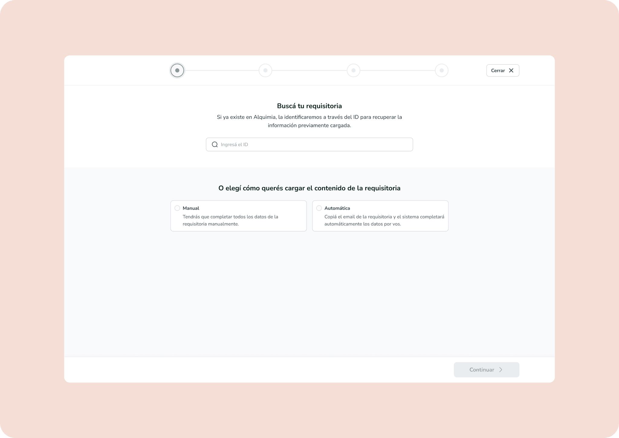
With the structure refined, we developed task flows and low-fidelity wireframes.
04 · Visual design
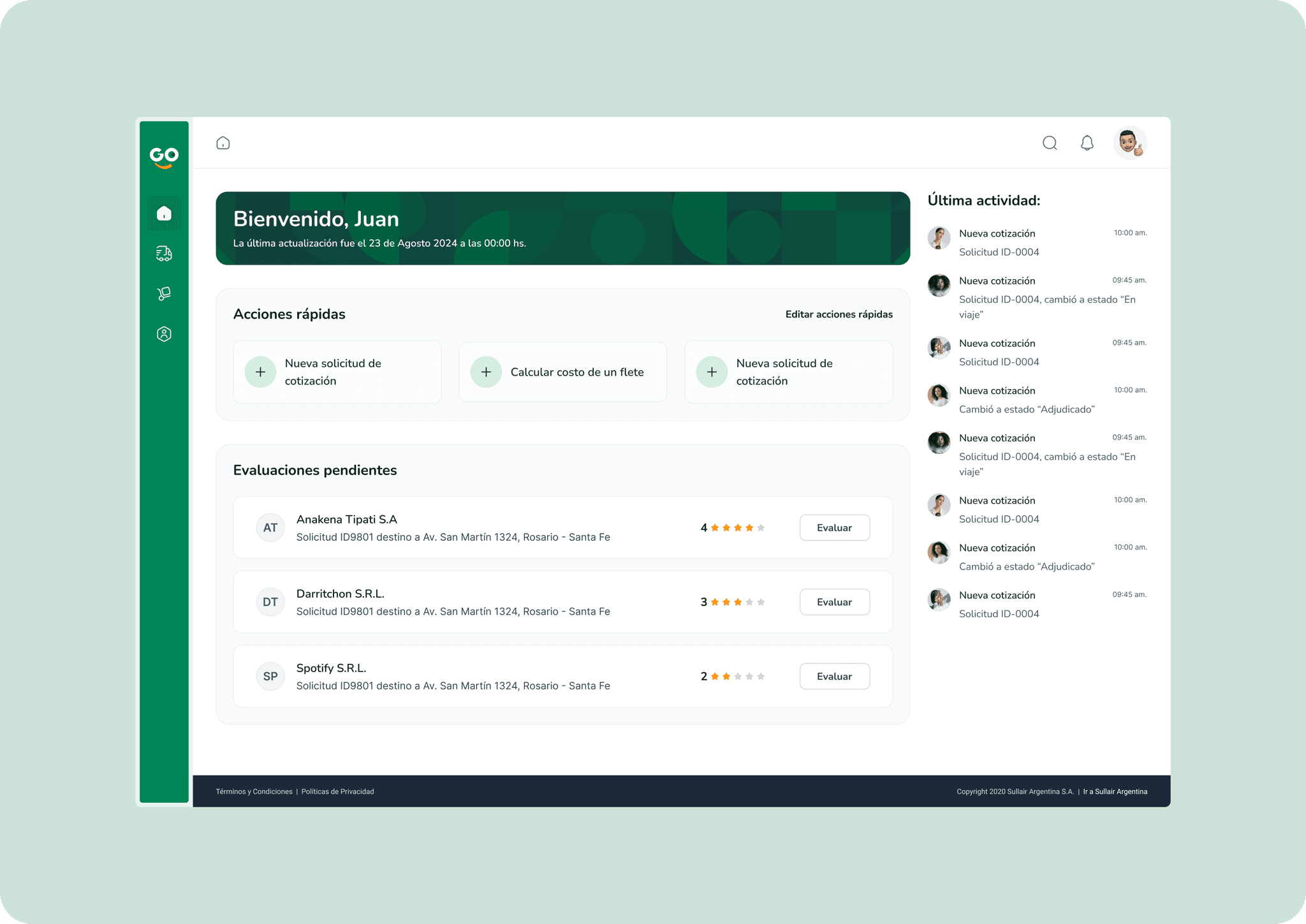
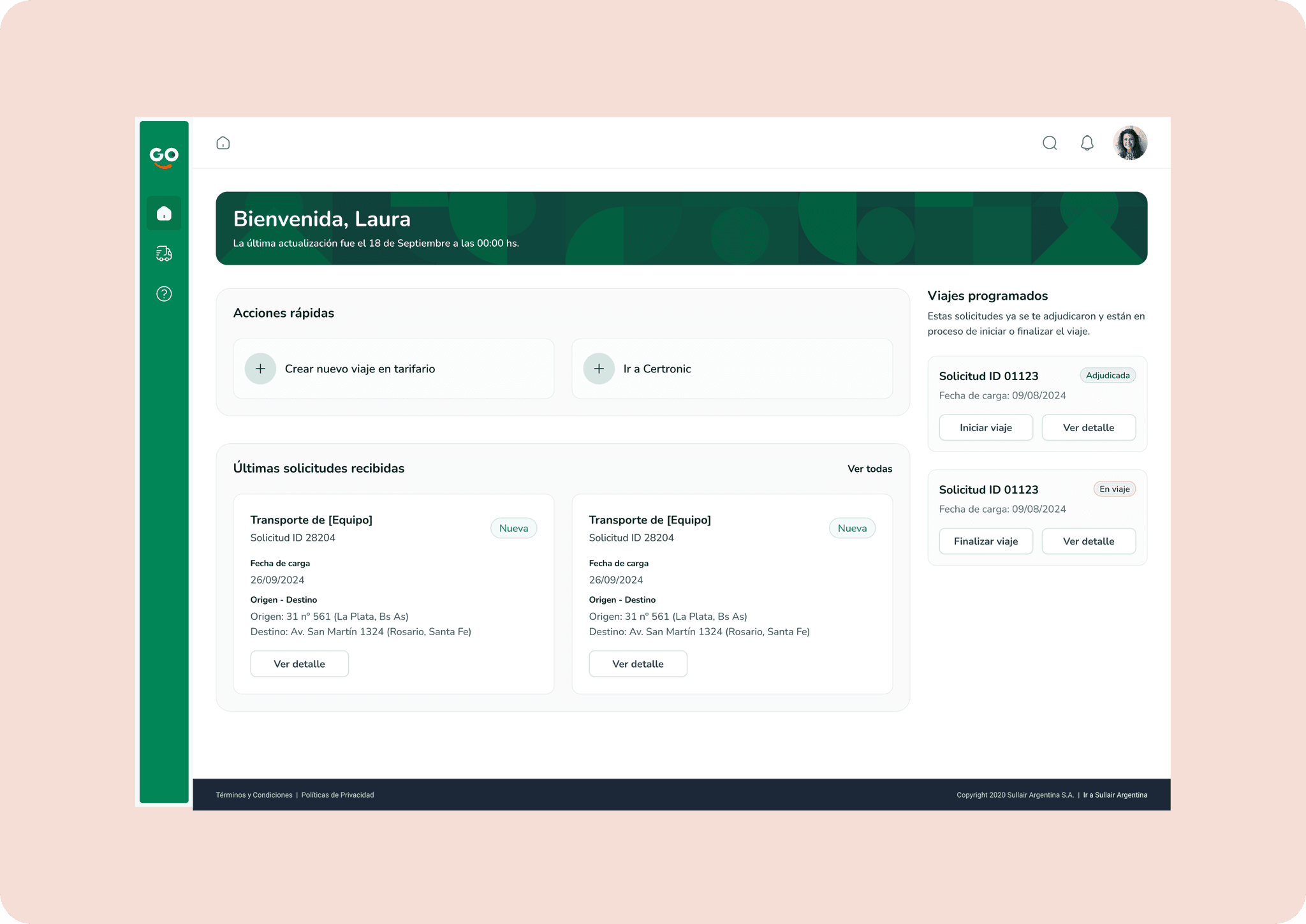
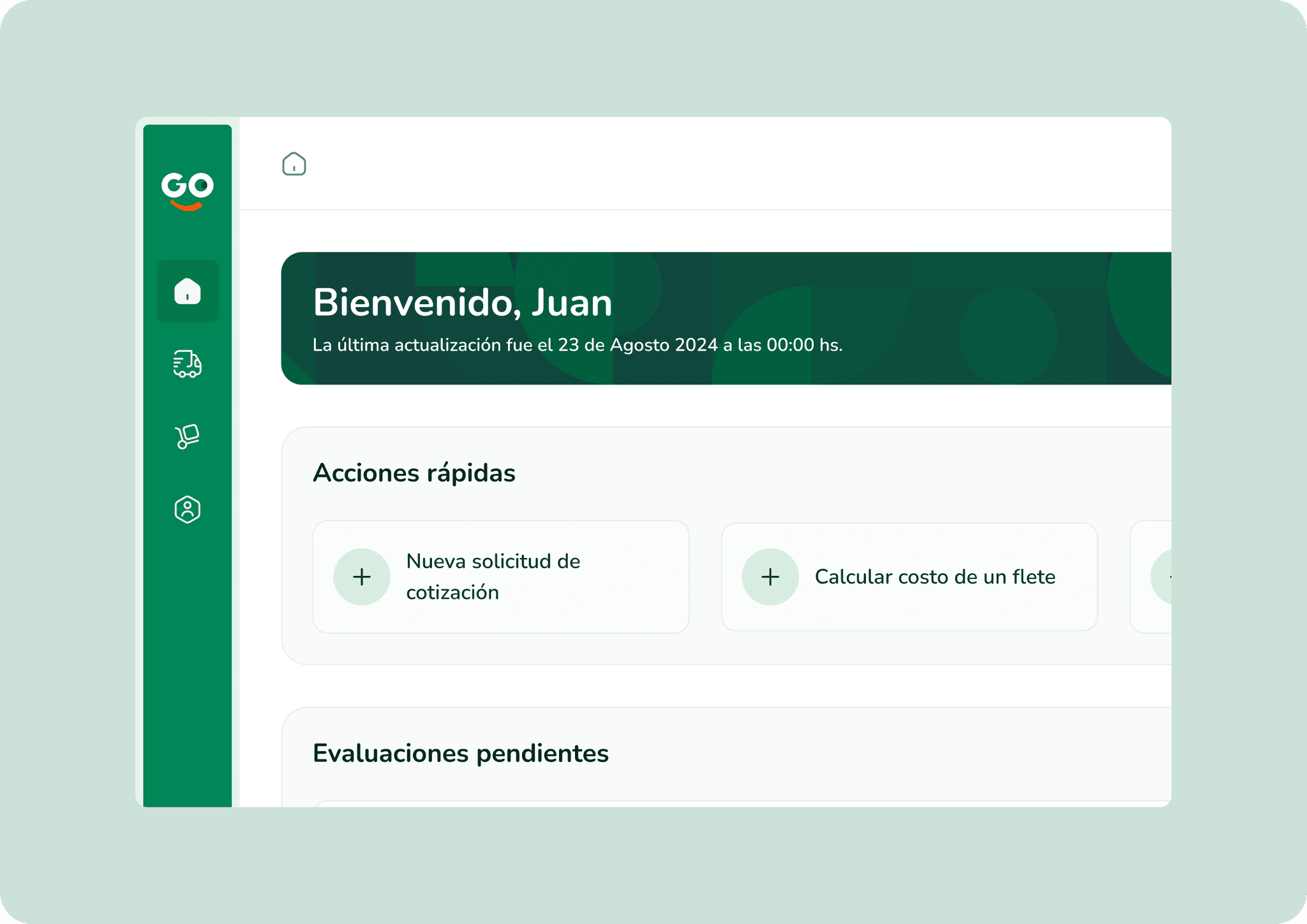
We started from Sullair’s existing design system. We kept its visual identity and extended the system with the components required for the new portal.
Green remained the primary brand and action color. Orange was used as an accent, while backgrounds, dividers and fields relied on a neutral scale to organize information without competing with the content.
The final design included one view for internal users and another for carriers. Each home screen prioritized the actions and information relevant to that role, while both worked with the same requests, quotes and statuses.
05 · Design decisions
Centralize requests, quotes, statuses and history instead of relying on separate email threads.
Allow carriers to submit offers through the portal and purchasing teams to compare them.
Prioritize access, tasks and content according to each role’s point of involvement in the process.
Create an architecture that could support additional workflows and features later.
06 · Outcome
Over 20 weeks, we defined the scope, architecture and workflows. That work took shape through user stories, task flows, wireframes and final screens.
This delivery closed the design stage and provided a foundation for continuing the work with development.
07 · What I learned
The research uncovered many opportunities, but technical constraints required us to prioritize. Returning to the original focus did not mean losing the work we had done: it helped us define a more realistic first version and leave room for the structure to grow.